Project Gallery
Explore Varied Card Designs in detail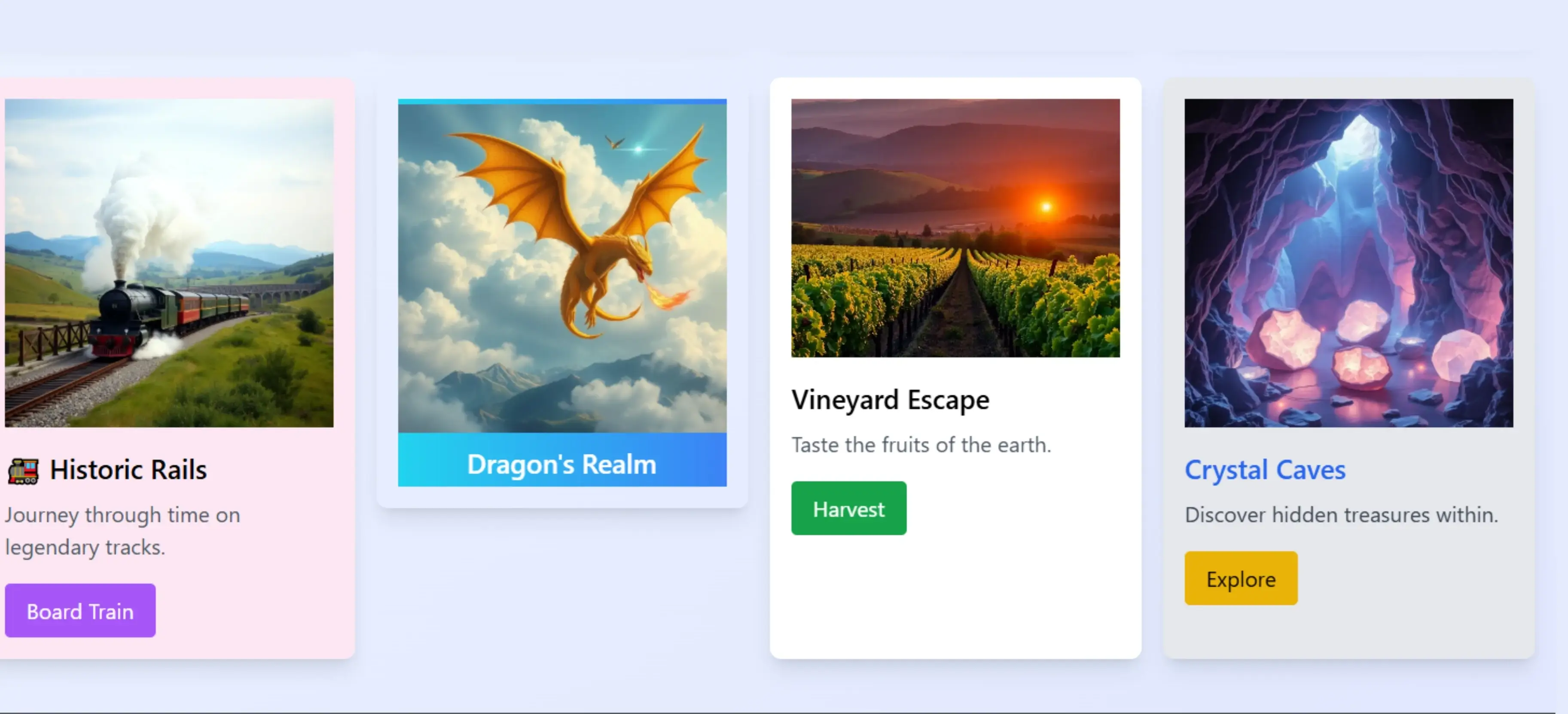
Project Overview
Varied Card Designs
Project Description
This design includes multiple card styles such as gradient cards with vibrant color schemes, neumorphic designs with soft shadows, glass morphism with transparency and blur effects, and special hover effect cards. It features advanced animations with smooth hover transitions, transform effects on interaction, and special lighting effects. The layout is fully responsive with a grid system that adapts to different screen sizes, ensuring a mobile-friendly experience. Visual elements are carefully managed with consistent alignment, modern color schemes, icon integration for visual appeal, and statistical data presentation. Modern CSS features such as backdrop filters for glass effects, CSS gradients for vibrant backgrounds, and advanced shadow effects further enhance the overall design.
HTML
<!DOCTYPE html>
<html lang="en">
<head>
<meta charset="UTF-8">
<meta name="viewport" content="width=device-width, initial-scale=1.0">
<title>Varied Card Designs</title>
<script src="https://cdn.tailwindcss.com"></script>
</head>
<body class="bg-gradient-to-br from-blue-50 to-indigo-100 min-h-screen p-6">
<div class="max-w-6xl mx-auto">
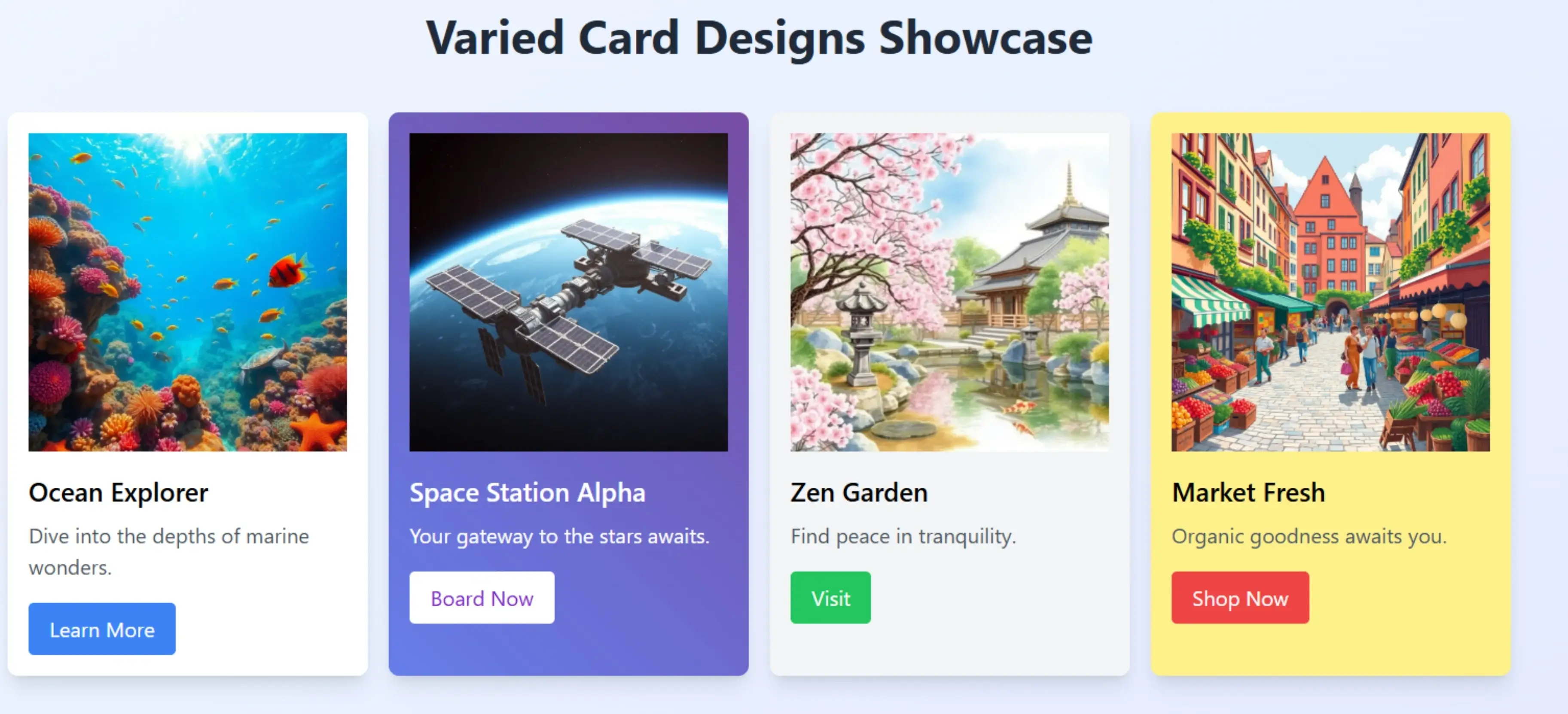
<h1 class="text-4xl font-bold text-center text-gray-800 mb-10">Varied Card Designs Showcase</h1>
<div class="card-grid">
<!-- Card Type 1: Basic clean layout -->
<div class="card card-type-1 bg-white shadow-lg rounded-lg overflow-hidden p-4">
<img src="https://storage.googleapis.com/workspace-0f70711f-8b4e-4d94-86f1-2a93ccde5887/image/a93fccfb-7c49-4d13-981e-97b4d22b169a.png" alt="A vibrant coral reef underwater scene with colorful fish, sunlight penetrating clear blue water, diverse marine life including starfish and turtles in a high-resolution photography style">
<h2 class="text-xl font-semibold mt-4">Ocean Explorer</h2>
<p class="text-gray-600 mt-2">Dive into the depths of marine wonders.</p>
<button class="mt-4 bg-blue-500 text-white px-4 py-2 rounded">Learn More</button>
</div>
<!-- Card Type 2: Gradient background with hover color shift -->
<div class="card card-type-2 shadow-lg rounded-lg overflow-hidden p-4 text-white">
<img src="https://storage.googleapis.com/workspace-0f70711f-8b4e-4d94-86f1-2a93ccde5887/image/90dafcfa-4c2a-4f66-ba4a-a01059728b1f.png" alt="A futuristic space station orbiting Earth with solar panels, modules, and starry background in a detailed sci-fi digital art rendering">
<h2 class="text-xl font-semibold mt-4">Space Station Alpha</h2>
<p class="mt-2">Your gateway to the stars awaits.</p>
<button class="mt-4 bg-white text-purple-700 px-4 py-2 rounded">Board Now</button>
</div>
<!-- Card Type 3: Unique shape on hover -->
<div class="card card-type-3 bg-gray-100 shadow-lg rounded-lg overflow-hidden p-4">
<img src="https://storage.googleapis.com/workspace-0f70711f-8b4e-4d94-86f1-2a93ccde5887/image/043378a1-296b-4cb9-815e-573757aa9ca4.png" alt="A serene Japanese garden with cherry blossoms, traditional stone lanterns, koi pond, and zen architecture in a peaceful watercolor painting style">
<h2 class="text-xl font-semibold mt-4">Zen Garden</h2>
<p class="text-gray-600 mt-2">Find peace in tranquility.</p>
<button class="mt-4 bg-green-500 text-white px-4 py-2 rounded">Visit</button>
</div>
<!-- Card Type 4: Text scaling effect -->
<div class="card card-type-4 bg-yellow-200 shadow-lg rounded-lg overflow-hidden p-4">
<img src="https://storage.googleapis.com/workspace-0f70711f-8b4e-4d94-86f1-2a93ccde5887/image/29b468e5-1d0b-475c-b173-b87ebc014867.png" alt="A bustling European market square with colorful stalls, fresh produce, cobblestone streets, and people in a vibrant illustration style">
<h2 class="text-xl font-semibold mt-4 text-content">Market Fresh</h2>
<p class="text-gray-600 mt-2 text-content">Organic goodness awaits you.</p>
<button class="mt-4 bg-red-500 text-white px-4 py-2 rounded">Shop Now</button>
</div>
<!-- Card Type 5: Icon rotation -->
<div class="card card-type-5 bg-pink-100 shadow-lg rounded-lg overflow-hidden p-4">
<img src="https://storage.googleapis.com/workspace-0f70711f-8b4e-4d94-86f1-2a93ccde5887/image/b814162b-0529-44b9-8027-7077a8b9e184.png" alt="A vintage steam locomotive puffing smoke, traveling through green countryside with bridges and distant mountains in a realistic train photography composition">
<h2 class="text-xl font-semibold mt-4">
<span class="icon">🚂</span> Historic Rails
</h2>
<p class="text-gray-600 mt-2">Journey through time on legendary tracks.</p>
<button class="mt-4 bg-purple-500 text-white px-4 py-2 rounded">Board Train</button>
</div>
<!-- Card Type 6: Flip effect -->
<div class="card card-type-6 shadow-lg rounded-lg overflow-hidden h-80 p-4">
<div class="card-type-6-inner">
<div class="card-type-6-front bg-gradient-to-r from-cyan-400 to-blue-500 text-white flex flex-col justify-center items-center">
<img src="https://storage.googleapis.com/workspace-0f70711f-8b4e-4d94-86f1-2a93ccde5887/image/694ca25e-a073-4b59-b4ce-1894cbc4ddd3.png" alt="A majestic dragon soaring through cloudy skies with mountains below, wings spread wide in a fantasy illustration with golden scales and fiery breath">
<h2 class="text-xl font-semibold mt-2">Dragon's Realm</h2>
</div>
<div class="card-type-6-back bg-gradient-to-r from-red-400 to-pink-500 text-white flex flex-col justify-center items-center">
<p class="mt-4 p-4">Unlock mythical adventures and ancient treasures.</p>
<button class="mt-4 bg-white text-red-500 px-4 py-2 rounded">Enter Realm</button>
</div>
</div>
</div>
<!-- Card Type 7: Image parallax effect -->
<div class="card card-type-7 bg-white shadow-lg rounded-lg overflow-hidden p-4">
<div class="overflow-hidden">
<img src="https://storage.googleapis.com/workspace-0f70711f-8b4e-4d94-86f1-2a93ccde5887/image/f5da0336-27f0-4607-9bdc-a3670efd4767.png" alt="A lush vineyard at sunset with rows of grapevines, picturesque hills, and rolling terrain in a warm golden hour photography style" class="parallax-img w-full h-48 object-cover">
</div>
<h2 class="text-xl font-semibold mt-4">Vineyard Escape</h2>
<p class="text-gray-600 mt-2">Taste the fruits of the earth.</p>
<button class="mt-4 bg-green-600 text-white px-4 py-2 rounded">Harvest</button>
</div>
<!-- Card Type 8: Glow effect -->
<div class="card card-type-8 bg-gray-200 shadow-lg rounded-lg overflow-hidden p-4">
<img src="https://storage.googleapis.com/workspace-0f70711f-8b4e-4d94-86f1-2a93ccde5887/image/50e39e74-ca48-4ca9-b75d-4f3aab706e4f.png" alt="A mystical crystal cave with glowing geodes, stalactites, and shimmering light reflections on walls in an ethereal fantasy art composition">
<h2 class="text-xl font-semibold mt-4 text-blue-600">Crystal Caves</h2>
<p class="text-gray-700 mt-2">Discover hidden treasures within.</p>
<button class="mt-4 bg-yellow-500 text-black px-4 py-2 rounded">Explore</button>
</div>
</div>
</div>
</body>
</html>CSS
<style>
        /* Base styles for all cards */
        .card {
            transition: all 0.3s ease;
            margin-bottom: 1rem;
        }
        /* Unique design 1: Skewed hover effect */
        .card-type-1:hover {
            transform: skewY(-5deg);
            box-shadow: 0 15px 30px rgba(0, 0, 0, 0.3);
        }
        /* Unique design 2: Color shift on hover */
        .card-type-2 {
            background: linear-gradient(45deg, #667eea 0%, #764ba2 100%);
        }
        .card-type-2:hover {
            background: linear-gradient(45deg, #f093fb 0%, #f5576c 100%);
            transform: scale(1.05);
        }
        /* Unique design 3: Rippled border effect */
        .card-type-3:hover {
            border-radius: 50% 50% 0% 50%;
            box-shadow: 0 10px 20px rgba(0, 0, 0, 0.2);
        }
        /* Unique design 4: Text scaling */
        .card-type-4 .text-content {
            transition: all 0.3s ease;
        }
        .card-type-4:hover .text-content {
            color: #ff6b6b;
            transform: scale(1.1);
        }
        /* Unique design 5: Icon rotation */
        .card-type-5:hover .icon {
            transform: rotate(180deg);
        }
        /* Unique design 6: Flip animation */
        .card-type-6 {
            perspective: 1000px;
        }
        .card-type-6-inner {
            position: relative;
            width: 100%;
            height: 100%;
            text-align: center;
            transition: transform 0.8s;
            transform-style: preserve-3d;
        }
        .card-type-6:hover .card-type-6-inner {
            transform: rotateY(180deg);
        }
        .card-type-6-front, .card-type-6-back {
            position: absolute;
            width: 100%;
            height: 100%;
            -webkit-backface-visibility: hidden;
            backface-visibility: hidden;
        }
        .card-type-6-back {
            transform: rotateY(180deg);
        }
        /* Unique design 7: Parallax-like image movement */
        .card-type-7:hover .parallax-img {
            transform: translateY(-20px) scale(1.1);
        }
        /* Unique design 8: Glow effect */
        .card-type-8:hover {
            box-shadow: 0 0 20px rgba(255, 215, 0, 0.8);
            background: rgba(255, 235, 59, 0.1);
        }
        /* Responsive adjustments */
        @media (min-width: 768px) {
            .card-grid {
                display: grid;
                grid-template-columns: repeat(2, 1fr);
                gap: 1rem;
            }
        }
        @media (min-width: 1024px) {
            .card-grid {
                grid-template-columns: repeat(4, 1fr);
            }
        }
    </style>
JavaScript
<script>
        // Add some JavaScript interactivity
        document.addEventListener('DOMContentLoaded', function() {
            const cards = document.querySelectorAll('.card');

            cards.forEach((card, index) => {
                // Staggered animation on load
                setTimeout(() => {
                    card.style.opacity = '0';
                    card.style.transform = 'translateY(20px)';

                    setTimeout(() => {
                        card.style.transition = 'opacity 0.5s, transform 0.5s';
                        card.style.opacity = '1';
                        card.style.transform = 'translateY(0)';
                    }, 100);
                }, index * 100);

                // Add click event for demo
                card.addEventListener('click', function() {
                    alert(`You clicked on card ${index + 1}!`);
                });
            });

            // Image error handling
            const images = document.querySelectorAll('img');
            images.forEach(img => {
                img.addEventListener('error', function() {
                    this.src = 'https://storage.googleapis.com/workspace-0f70711f-8b4e-4d94-86f1-2a93ccde5887/image/e17ddd30-c423-4e8a-ab18-ac7573bf6937.png';
                    this.alt = 'A placeholder image showing a stylized error icon in gray tones indicating the original image failed to load';
                });
            });
        });
    </script>