Project Gallery
Explore 4 Steps to Achieve Your Goals in detail
1
/1
100%
Project Overview
4 Steps to Achieve Your Goals
Project Description
4 Steps to Achieve Your Goals
Improved Aesthetics: Gradient background, semi-transparent cards, and a modern font (Poppins) from Google Fonts.
- Advanced Animations: Hover effects with scaling step numbers and a subtle shine animation on cards.
- Tailwind CSS: Complements Bootstrap for rapid styling and responsive utilities.
- Enhanced Interactivity: JavaScript provides step-specific alerts with tailored messages.
- Responsive Alignment: Bootstrap's grid system ensures perfect alignment across devices, with Tailwind for fine-tuned spacing.
- Visual Polish: Shadows, rounded corners, gradients, and text shadows for a premium look.
HTML
<!DOCTYPE html>
<html lang="en">
<head>
<meta charset="UTF-8">
<meta name="viewport" content="width=device-width, initial-scale=1.0">
<title>4 Easy Steps - Premium Design</title>
<!-- Bootstrap CSS -->
<link href="https://cdn.jsdelivr.net/npm/bootstrap@5.3.0/dist/css/bootstrap.min.css" rel="stylesheet">
<!-- Tailwind CSS -->
<link href="https://cdn.jsdelivr.net/npm/tailwindcss@2.2.19/dist/tailwind.min.css" rel="stylesheet">
<!-- Google Fonts -->
<link href="https://fonts.googleapis.com/css2?family=Inter:wght@300;500;700&display=swap" rel="stylesheet">
</head>
<body>
<div class="step-container">
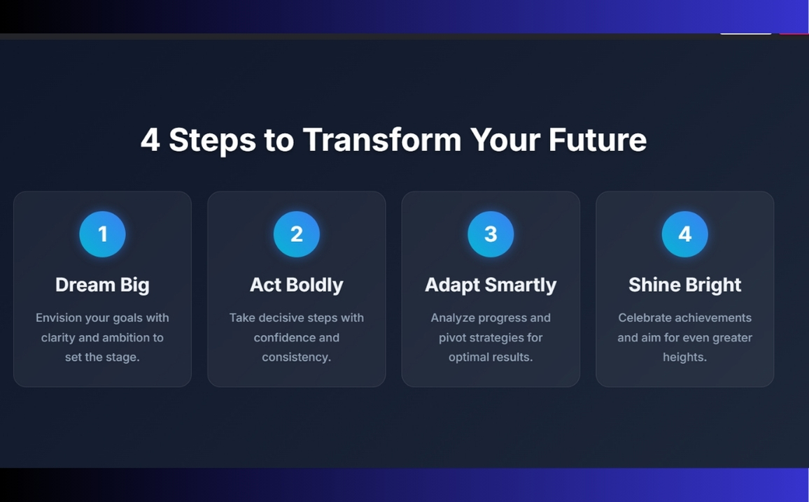
<h1 class="header-title text-center">4 Steps to Transform Your Future</h1>
<div class="row">
<div class="col-md-3 col-sm-6">
<div class="step-card" onclick="showStepInfo(1)">
<div class="step-number">1</div>
<div class="step-title">Dream Big</div>
<div class="step-description">Envision your goals with clarity and ambition to set the stage.</div>
</div>
</div>
<div class="col-md-3 col-sm-6">
<div class="step-card" onclick="showStepInfo(2)">
<div class="step-number">2</div>
<div class="step-title">Act Boldly</div>
<div class="step-description">Take decisive steps with confidence and consistency.</div>
</div>
</div>
<div class="col-md-3 col-sm-6">
<div class="step-card" onclick="showStepInfo(3)">
<div class="step-number">3</div>
<div class="step-title">Adapt Smartly</div>
<div class="step-description">Analyze progress and pivot strategies for optimal results.</div>
</div>
</div>
<div class="col-md-3 col-sm-6">
<div class="step-card" onclick="showStepInfo(4)">
<div class="step-number">4</div>
<div class="step-title">Shine Bright</div>
<div class="step-description">Celebrate achievements and aim for even greater heights.</div>
</div>
</div>
</div>
</div>
<!-- Bootstrap JS and Popper.js -->
</body>
</html>CSS
<style>
        body {
            font-family: 'Inter', sans-serif;
            background: linear-gradient(135deg, #0f172a, #1e293b);
            color: #e2e8f0;
            min-height: 100vh;
            display: flex;
            align-items: center;
            justify-content: center;
            padding: 20px;
            overflow-x: hidden;
        }
        .step-container {
            max-width: 1200px;
            margin: 0 auto;
            padding: 40px 20px;
        }
        .step-card {
            background: rgba(255, 255, 255, 0.05);
            backdrop-filter: blur(10px);
            border: 1px solid rgba(255, 255, 255, 0.1);
            border-radius: 20px;
            padding: 30px;
            text-align: center;
            transition: transform 0.4s ease, box-shadow 0.4s ease, background 0.4s ease;
            position: relative;
            overflow: hidden;
            cursor: pointer;
        }
        .step-card:hover {
            transform: translateY(-10px);
            box-shadow: 0 12px 24px rgba(0, 0, 0, 0.5);
            background: rgba(255, 255, 255, 0.1);
        }
        .step-number {
            display: inline-flex;
            align-items: center;
            justify-content: center;
            width: 70px;
            height: 70px;
            background: linear-gradient(45deg, #06b6d4, #3b82f6);
            color: #ffffff;
            border-radius: 50%;
            font-size: 32px;
            font-weight: 700;
            margin-bottom: 20px;
            transition: transform 0.3s ease, box-shadow 0.3s ease;
            box-shadow: 0 0 15px rgba(59, 130, 246, 0.5);
        }
        .step-card:hover .step-number {
            transform: scale(1.15);
            box-shadow: 0 0 20px rgba(59, 130, 246, 0.8);
        }
        .step-title {
            font-size: 1.8rem;
            font-weight: 700;
            color: #f1f5f9;
            margin-bottom: 15px;
            text-shadow: 0 1px 2px rgba(0, 0, 0, 0.2);
        }
        .step-description {
            font-size: 1.1rem;
            color: #94a3b8;
            line-height: 1.7;
        }
        .step-card::before {
            content: '';
            position: absolute;
            top: -50%;
            left: -50%;
            width: 200%;
            height: 200%;
            background: radial-gradient(circle, rgba(59, 130, 246, 0.3) 0%, transparent 70%);
            transition: transform 0.6s ease;
            transform: rotate(45deg);
            opacity: 0;
        }
        .step-card:hover::before {
            opacity: 1;
            transform: rotate(0deg);
        }
        .header-title {
            font-size: 3rem;
            font-weight: 700;
            color: #ffffff;
            text-shadow: 0 2px 6px rgba(0, 0, 0, 0.4);
            margin-bottom: 50px;
            animation: fadeIn 1s ease-in;
        }
        @keyframes fadeIn {
            from { opacity: 0; transform: translateY(-20px); }
            to { opacity: 1; transform: translateY(0); }
        }
        .step-card {
            animation: slideIn 0.5s ease-in-out forwards;
        }
        .step-card:nth-child(1) { animation-delay: 0.1s; }
        .step-card:nth-child(2) { animation-delay: 0.2s; }
        .step-card:nth-child(3) { animation-delay: 0.3s; }
        .step-card:nth-child(4) { animation-delay: 0.4s; }
        @keyframes slideIn {
            from { opacity: 0; transform: translateY(30px); }
            to { opacity: 1; transform: translateY(0); }
        }
        @media (max-width: 768px) {
            .step-card {
                margin-bottom: 30px;
            }
            .header-title {
                font-size: 2.2rem;
            }
            .step-number {
                width: 60px;
                height: 60px;
                font-size: 28px;
            }
            .step-title {
                font-size: 1.5rem;
            }
        }
    </style>
JavaScript
<script src="https://cdn.jsdelivr.net/npm/bootstrap@5.3.0/dist/js/bootstrap.bundle.min.js"></script>
    <script>
        function showStepInfo(step) {
            const messages = {
                1: "Step 1: Dream big by setting ambitious, clear goals to guide your journey.",
                2: "Step 2: Act boldly with consistent, confident steps toward success.",
                3: "Step 3: Adapt smartly by reviewing progress and refining your approach.",
                4: "Step 4: Shine bright by celebrating wins and setting new targets!"
            };
            const stepCard = document.querySelector(`.step-card:nth-child(${step})`);
            stepCard.classList.add('animate-bounce');
            setTimeout(() => stepCard.classList.remove('animate-bounce'), 500);
            alert(messages[step]);
        }
    </script>