Project Gallery
Explore Modern Responsive well Design button in detail
1
/1
100%
Project Overview
Modern Responsive well Design button
Project Description
Modern Responsive well Design button
well-designed button with HTML, CSS, and JavaScript that is well-aligned. They mentioned "bs js" which I believe might be a typo or shorthand for "JavaScript". I need to create a single HTML file with:
- A well-designed button with good styling
- Proper alignment
- JavaScript functionality
- Modern, responsive design
I'll create a button with multiple styles (primary, secondary, success, danger) that are well-aligned in a grid layout, with hover effects and click functionality. I'll use modern CSS with flexbox for alignment and add some JavaScript for interactive feedback.
HTML
<!DOCTYPE html>
<html lang="en">
<head>
<meta charset="UTF-8" />
<meta name="viewport" content="width=device-width, initial-scale=1" />
<title>Elegant Button Designs</title>
</head>
<body>
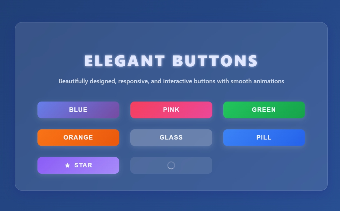
<main class="container" role="main" aria-label="Elegant button examples">
<h1>Elegant Buttons</h1>
<p class="subtitle">Beautifully designed, responsive, and interactive buttons with smooth animations</p>
<div class="button-grid" role="list">
<button class="btn btn-blue" role="listitem" aria-label="Blue gradient button" type="button">Blue</button>
<button class="btn btn-pink" role="listitem" aria-label="Pink gradient button" type="button">Pink</button>
<button class="btn btn-green" role="listitem" aria-label="Green gradient button" type="button">Green</button>
<button class="btn btn-orange" role="listitem" aria-label="Orange gradient button" type="button">Orange</button>
<button class="btn btn-glass" role="listitem" aria-label="Glass style button" type="button">Glass</button>
<button class="btn btn-pill" role="listitem" aria-label="Rounded pill button" type="button">Pill</button>
<button class="btn btn-icon" role="listitem" aria-label="Button with star icon" type="button">
<svg aria-hidden="true" focusable="false" viewBox="0 0 24 24" >
<path d="M12 17.27L18.18 21l-1.64-7.03L22 9.24l-7.19-.61L12 2 9.19 8.63 2 9.24l5.46 4.73L5.82 21z"/>
</svg>
Star
</button>
<button class="btn btn-loading" role="listitem" aria-label="Loading button" type="button" disabled>Loading</button>
</div>
</main>
</body>
</html>CSS
<style>
  /* Reset and base */
  *, *::before, *::after {
    box-sizing: border-box;
  }
  body {
    margin: 0; padding: 0;
    font-family: 'Segoe UI', Tahoma, Geneva, Verdana, sans-serif;
    background: linear-gradient(135deg, #1e3c72 0%, #2a5298 100%);
    min-height: 100vh;
    display: flex;
    justify-content: center;
    align-items: center;
    padding: 2rem;
    color: #f0f4f8;
  }
  .container {
    background: rgba(255 255 255 / 0.1);
    border-radius: 20px;
    padding: 3rem 4rem;
    max-width: 900px;
    width: 100%;
    box-shadow:
      0 8px 32px 0 rgba(31, 38, 135, 0.37);
    backdrop-filter: blur(12px);
    -webkit-backdrop-filter: blur(12px);
    border: 1px solid rgba(255 255 255 / 0.18);
  }
  h1 {
    text-align: center;
    font-weight: 900;
    font-size: 2.8rem;
    margin-bottom: 1rem;
    letter-spacing: 0.1em;
    text-transform: uppercase;
    color: #e0e7ff;
    text-shadow: 0 0 8px rgba(224, 231, 255, 0.7);
  }
  p.subtitle {
    text-align: center;
    font-weight: 500;
    font-size: 1.1rem;
    margin-bottom: 3rem;
    color: #cbd5e1;
  }

  /* Grid for buttons */
  .button-grid {
    display: grid;
    grid-template-columns: repeat(auto-fit,minmax(180px,1fr));
    gap: 2rem;
  }

  /* Base button style */
  button.btn {
    position: relative;
    display: inline-flex;
    justify-content: center;
    align-items: center;
    padding: 0.85rem 2.2rem;
    font-size: 1.1rem;
    font-weight: 700;
    border-radius: 12px;
    border: none;
    cursor: pointer;
    user-select: none;
    overflow: hidden;
    transition:
      background-color 0.3s ease,
      box-shadow 0.3s ease,
      transform 0.15s ease;
    box-shadow:
      0 4px 15px rgba(255 255 255 / 0.15);
    color: #f0f4f8;
    text-transform: uppercase;
    letter-spacing: 0.08em;
    backdrop-filter: blur(8px);
    -webkit-backdrop-filter: blur(8px);
  }
  button.btn:focus-visible {
    outline: 3px solid #a5b4fc;
    outline-offset: 3px;
  }
  button.btn:active {
    transform: scale(0.97);
    box-shadow:
      0 2px 8px rgba(255 255 255 / 0.1);
  }
  button.btn:disabled {
    cursor: not-allowed;
    opacity: 0.5;
    box-shadow: none;
    background-color: rgba(255 255 255 / 0.1);
    color: #a0aec0;
  }

  /* Ripple effect container */
  button.btn .ripple {
    position: absolute;
    border-radius: 50%;
    transform: scale(0);
    animation: ripple-effect 600ms linear;
    background-color: rgba(255 255 255 / 0.4);
    pointer-events: none;
    z-index: 10;
  }
  @keyframes ripple-effect {
    to {
      transform: scale(4);
      opacity: 0;
    }
  }

  /* Button variants */

  /* 1. Gradient Blue */
  .btn-blue {
    background: linear-gradient(135deg, #667eea 0%, #764ba2 100%);
    box-shadow:
      0 8px 20px rgba(102, 126, 234, 0.6);
  }
  .btn-blue:hover:not(:disabled) {
    background: linear-gradient(135deg, #5a6de0 0%, #6a3a9a 100%);
    box-shadow:
      0 12px 30px rgba(102, 126, 234, 0.8);
  }

  /* 2. Gradient Pink */
  .btn-pink {
    background: linear-gradient(135deg, #f43f5e 0%, #ec4899 100%);
    box-shadow:
      0 8px 20px rgba(244, 63, 94, 0.6);
  }
  .btn-pink:hover:not(:disabled) {
    background: linear-gradient(135deg, #e63654 0%, #db3f8f 100%);
    box-shadow:
      0 12px 30px rgba(244, 63, 94, 0.8);
  }

  /* 3. Gradient Green */
  .btn-green {
    background: linear-gradient(135deg, #22c55e 0%, #16a34a 100%);
    box-shadow:
      0 8px 20px rgba(34, 197, 94, 0.6);
  }
  .btn-green:hover:not(:disabled) {
    background: linear-gradient(135deg, #1eab53 0%, #13803d 100%);
    box-shadow:
      0 12px 30px rgba(34, 197, 94, 0.8);
  }

  /* 4. Gradient Orange */
  .btn-orange {
    background: linear-gradient(135deg, #f97316 0%, #ea580c 100%);
    box-shadow:
      0 8px 20px rgba(249, 115, 22, 0.6);
  }
  .btn-orange:hover:not(:disabled) {
    background: linear-gradient(135deg, #e66f0f 0%, #d94e0a 100%);
    box-shadow:
      0 12px 30px rgba(249, 115, 22, 0.8);
  }

  /* 5. Glassmorphism Outline */
  .btn-glass {
    background: rgba(255 255 255 / 0.15);
    border: 2px solid rgba(255 255 255 / 0.4);
    color: #e0e7ff;
    box-shadow:
      0 8px 32px 0 rgba(31, 38, 135, 0.37);
  }
  .btn-glass:hover:not(:disabled) {
    background: rgba(255 255 255 / 0.3);
    border-color: rgba(255 255 255 / 0.7);
    box-shadow:
      0 12px 40px 0 rgba(31, 38, 135, 0.6);
  }

  /* 6. Rounded Pill */
  .btn-pill {
    border-radius: 50px;
    background: linear-gradient(135deg, #3b82f6 0%, #2563eb 100%);
    box-shadow:
      0 8px 20px rgba(59, 130, 246, 0.6);
  }
  .btn-pill:hover:not(:disabled) {
    background: linear-gradient(135deg, #2563eb 0%, #1d4ed8 100%);
    box-shadow:
      0 12px 30px rgba(59, 130, 246, 0.8);
  }

  /* 7. Icon Button */
  .btn-icon {
    background: linear-gradient(135deg, #8b5cf6 0%, #a78bfa 100%);
    box-shadow:
      0 8px 20px rgba(139, 92, 246, 0.6);
    gap: 0.6rem;
    padding: 0.85rem 1.6rem;
  }
  .btn-icon:hover:not(:disabled) {
    background: linear-gradient(135deg, #7c3aed 0%, #8b5cf6 100%);
    box-shadow:
      0 12px 30px rgba(139, 92, 246, 0.8);
  }
  .btn-icon svg {
    width: 1.2rem;
    height: 1.2rem;
    fill: currentColor;
  }

  /* Loading Button */
  .btn-loading {
    position: relative;
    pointer-events: none;
    color: transparent !important;
  }
  .btn-loading::after {
    content: "";
    position: absolute;
    top: 50%; left: 50%;
    width: 1.4rem; height: 1.4rem;
    margin: -0.7rem 0 0 -0.7rem;
    border: 3px solid rgba(255 255 255 / 0.4);
    border-top-color: #fff;
    border-radius: 50%;
    animation: spin 1s linear infinite;
  }
  @keyframes spin {
    to { transform: rotate(360deg); }
  }

  /* Responsive */
  @media (max-width: 600px) {
    .container {
      padding: 2rem 2rem;
    }
    .button-grid {
      grid-template-columns: repeat(auto-fit,minmax(140px,1fr));
      gap: 1.5rem;
    }
    button.btn {
      font-size: 1rem;
      padding: 0.7rem 1.6rem;
    }
  }
</style>
JavaScript
<script>
  // Ripple effect on buttons
  document.querySelectorAll('button.btn').forEach(button => {
    button.addEventListener('click', e => {
      if(button.disabled) return;
      const rect = button.getBoundingClientRect();
      const ripple = document.createElement('span');
      ripple.classList.add('ripple');
      const size = Math.max(rect.width, rect.height);
      ripple.style.width = ripple.style.height = size + 'px';
      ripple.style.left = (e.clientX - rect.left - size/2) + 'px';
      ripple.style.top = (e.clientY - rect.top - size/2) + 'px';
      button.appendChild(ripple);
      setTimeout(() => ripple.remove(), 600);
    });
  });
</script>