Project Gallery
Explore Modern Responsive button in detail
1
/1
100%
Project Overview
Modern Responsive button
Project Description
Modern Responsive button
well-designed button with HTML, CSS, and JavaScript that is well-aligned. They mentioned "bs js" which I believe might be a typo or shorthand for "JavaScript". I need to create a single HTML file with:
- A well-designed button with good styling
- Proper alignment
- JavaScript functionality
- Modern, responsive design
I'll create a button with multiple styles (primary, secondary, success, danger) that are well-aligned in a grid layout, with hover effects and click functionality. I'll use modern CSS with flexbox for alignment and add some JavaScript for interactive feedback.
HTML
<!DOCTYPE html>
<html lang="en">
<head>
<meta charset="UTF-8">
<meta name="viewport" content="width=device-width, initial-scale=1.0">
<title>Beautiful Button Collection</title>
</head>
<body>
<div class="container">
<div class="header">
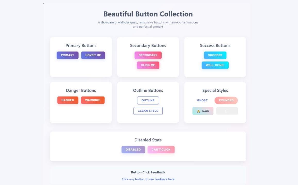
<h1>Beautiful Button Collection</h1>
<p>A showcase of well-designed, responsive buttons with smooth animations and perfect alignment</p>
</div>
<div class="button-grid">
<!-- Primary Buttons -->
<div class="button-section">
<h2>Primary Buttons</h2>
<div class="button-row">
<button class="btn btn-primary" onclick="handleClick('Primary Button')">
Primary
</button>
<button class="btn btn-primary" onclick="handleClick('Hover Me')">
Hover Me
</button>
</div>
</div>
<!-- Secondary Buttons -->
<div class="button-section">
<h2>Secondary Buttons</h2>
<div class="button-row">
<button class="btn btn-secondary" onclick="handleClick('Secondary Button')">
Secondary
</button>
<button class="btn btn-secondary" onclick="handleClick('Click Me')">
Click Me
</button>
</div>
</div>
<!-- Success Buttons -->
<div class="button-section">
<h2>Success Buttons</h2>
<div class="button-row">
<button class="btn btn-success" onclick="handleClick('Success Button')">
Success
</button>
<button class="btn btn-success" onclick="handleClick('Well Done!')">
Well Done!
</button>
</div>
</div>
<!-- Danger Buttons -->
<div class="button-section">
<h2>Danger Buttons</h2>
<div class="button-row">
<button class="btn btn-danger" onclick="handleClick('Danger Button')">
Danger
</button>
<button class="btn btn-danger" onclick="handleClick('Warning!')">
Warning!
</button>
</div>
</div>
<!-- Outline Buttons -->
<div class="button-section">
<h2>Outline Buttons</h2>
<div class="button-row">
<button class="btn btn-outline" onclick="handleClick('Outline Button')">
Outline
</button>
<button class="btn btn-outline" onclick="handleClick('Clean Style')">
Clean Style
</button>
</div>
</div>
<!-- Special Buttons -->
<div class="button-section">
<h2>Special Styles</h2>
<div class="button-row">
<button class="btn btn-ghost" onclick="handleClick('Ghost Button')">
Ghost
</button>
<button class="btn btn-rounded" onclick="handleClick('Rounded Button')">
Rounded
</button>
</div>
<div class="button-row">
<button class="btn btn-icon" onclick="handleClick('Icon Button')">
<span>⭐</span> Icon
</button>
<button class="btn btn-loading" onclick="handleClick('Loading Button')">
Loading
</button>
</div>
</div>
</div>
<!-- Disabled Buttons -->
<div class="button-section">
<h2>Disabled State</h2>
<div class="button-row">
<button class="btn btn-primary" disabled onclick="handleClick('Disabled Primary')">
Disabled
</button>
<button class="btn btn-secondary" disabled onclick="handleClick('Disabled Secondary')">
Can't Click
</button>
</div>
</div>
<!-- Feedback Section -->
<div class="feedback">
<h3>Button Click Feedback</h3>
<p id="click-feedback">Click any button to see feedback here</p>
</div>
</div>
</body>
</html>CSS
<style>
        * {
            margin: 0;
            padding: 0;
            box-sizing: border-box;
        }

        body {
            font-family: 'Segoe UI', Tahoma, Geneva, Verdana, sans-serif;
            background: linear-gradient(135deg, #667eea 0%, #764ba2 100%);
            min-height: 100vh;
            padding: 40px 20px;
            color: #333;
        }

        .container {
            max-width: 1200px;
            margin: 0 auto;
            background: rgba(255, 255, 255, 0.95);
            border-radius: 20px;
            padding: 40px;
            box-shadow: 0 20px 40px rgba(0, 0, 0, 0.1);
            backdrop-filter: blur(10px);
        }

        .header {
            text-align: center;
            margin-bottom: 50px;
        }

        .header h1 {
            font-size: 2.5rem;
            color: #4a5568;
            margin-bottom: 10px;
            font-weight: 700;
        }

        .header p {
            font-size: 1.1rem;
            color: #718096;
            max-width: 600px;
            margin: 0 auto;
        }

        .button-grid {
            display: grid;
            grid-template-columns: repeat(auto-fit, minmax(300px, 1fr));
            gap: 30px;
            margin-bottom: 50px;
        }

        .button-section {
            background: white;
            padding: 30px;
            border-radius: 15px;
            box-shadow: 0 10px 25px rgba(0, 0, 0, 0.05);
            text-align: center;
        }

        .button-section h2 {
            font-size: 1.5rem;
            color: #4a5568;
            margin-bottom: 20px;
            font-weight: 600;
        }

        .button-row {
            display: flex;
            justify-content: center;
            align-items: center;
            gap: 15px;
            margin-bottom: 15px;
            flex-wrap: wrap;
        }

        /* Base Button Styles */
        .btn {
            padding: 12px 24px;
            border: none;
            border-radius: 8px;
            font-size: 16px;
            font-weight: 600;
            cursor: pointer;
            transition: all 0.3s ease;
            outline: none;
            position: relative;
            overflow: hidden;
            text-transform: uppercase;
            letter-spacing: 0.5px;
        }

        .btn:before {
            content: '';
            position: absolute;
            top: 0;
            left: -100%;
            width: 100%;
            height: 100%;
            background: linear-gradient(90deg, transparent, rgba(255,255,255,0.2), transparent);
            transition: left 0.5s ease;
        }

        .btn:hover:before {
            left: 100%;
        }

        /* Primary Button */
        .btn-primary {
            background: linear-gradient(45deg, #667eea, #764ba2);
            color: white;
            box-shadow: 0 4px 15px rgba(102, 126, 234, 0.3);
        }

        .btn-primary:hover {
            transform: translateY(-2px);
            box-shadow: 0 8px 25px rgba(102, 126, 234, 0.4);
        }

        /* Secondary Button */
        .btn-secondary {
            background: linear-gradient(45deg, #f093fb, #f5576c);
            color: white;
            box-shadow: 0 4px 15px rgba(245, 87, 108, 0.3);
        }

        .btn-secondary:hover {
            transform: translateY(-2px);
            box-shadow: 0 8px 25px rgba(245, 87, 108, 0.4);
        }

        /* Success Button */
        .btn-success {
            background: linear-gradient(45deg, #4facfe, #00f2fe);
            color: white;
            box-shadow: 0 4px 15px rgba(79, 172, 254, 0.3);
        }

        .btn-success:hover {
            transform: translateY(-2px);
            box-shadow: 0 8px 25px rgba(79, 172, 254, 0.4);
        }

        /* Danger Button */
        .btn-danger {
            background: linear-gradient(45deg, #ff6b6b, #ee5a24);
            color: white;
            box-shadow: 0 4px 15px rgba(255, 107, 107, 0.3);
        }

        .btn-danger:hover {
            transform: translateY(-2px);
            box-shadow: 0 8px 25px rgba(255, 107, 107, 0.4);
        }

        /* Outline Button */
        .btn-outline {
            background: transparent;
            border: 2px solid #667eea;
            color: #667eea;
        }

        .btn-outline:hover {
            background: #667eea;
            color: white;
            transform: translateY(-2px);
        }

        /* Ghost Button */
        .btn-ghost {
            background: transparent;
            color: #667eea;
            border: 2px solid transparent;
        }

        .btn-ghost:hover {
            background: rgba(102, 126, 234, 0.1);
            border-color: #667eea;
            transform: translateY(-2px);
        }

        /* Rounded Button */
        .btn-rounded {
            border-radius: 25px;
            background: linear-gradient(45deg, #ff9a9e, #fad0c4);
            color: white;
        }

        /* Icon Button */
        .btn-icon {
            display: flex;
            align-items: center;
            gap: 8px;
            background: linear-gradient(45deg, #a8edea, #fed6e3);
            color: #4a5568;
        }

        /* Loading Button */
        .btn-loading {
            position: relative;
            color: transparent;
        }

        .btn-loading:after {
            content: '';
            position: absolute;
            width: 20px;
            height: 20px;
            top: 50%;
            left: 50%;
            margin: -10px 0 0 -10px;
            border: 2px solid rgba(255,255,255,0.3);
            border-top: 2px solid white;
            border-radius: 50%;
            animation: spin 1s linear infinite;
        }

        @keyframes spin {
            0% { transform: rotate(0deg); }
            100% { transform: rotate(360deg); }
        }

        /* Disabled Button */
        .btn:disabled {
            opacity: 0.6;
            cursor: not-allowed;
            transform: none !important;
        }

        .btn:disabled:hover {
            transform: none !important;
            box-shadow: 0 4px 15px rgba(0,0,0,0.1) !important;
        }

        /* Feedback Section */
        .feedback {
            text-align: center;
            padding: 20px;
            background: #f7fafc;
            border-radius: 10px;
            margin-top: 30px;
        }

        .feedback h3 {
            color: #4a5568;
            margin-bottom: 15px;
        }

        #click-feedback {
            font-size: 1.1rem;
            color: #667eea;
            font-weight: 500;
            min-height: 24px;
        }

        /* Responsive Design */
        @media (max-width: 768px) {
            .container {
                padding: 20px;
            }

            .button-grid {
                grid-template-columns: 1fr;
                gap: 20px;
            }

            .button-section {
                padding: 20px;
            }

            .header h1 {
                font-size: 2rem;
            }
        }

        @media (max-width: 480px) {
            .btn {
                padding: 10px 20px;
                font-size: 14px;
            }

            .button-row {
                flex-direction: column;
                gap: 10px;
            }
        }
    </style>
JavaScript
<script>
        // Button click handler
        function handleClick(buttonText) {
            const feedback = document.getElementById('click-feedback');
            feedback.textContent = `You clicked: "${buttonText}"`;

            // Add visual feedback
            feedback.style.color = '#48bb78';
            feedback.style.fontWeight = 'bold';

            // Reset after 2 seconds
            setTimeout(() => {
                feedback.style.color = '#667eea';
                feedback.style.fontWeight = '500';
            }, 2000);
        }

        // Add ripple effect to all buttons
        document.addEventListener('DOMContentLoaded', function() {
            const buttons = document.querySelectorAll('.btn');

            buttons.forEach(button => {
                button.addEventListener('click', function(e) {
                    const x = e.clientX - e.target.getBoundingClientRect().left;
                    const y = e.clientY - e.target.getBoundingClientRect().top;

                    const ripple = document.createElement('span');
                    ripple.classList.add('ripple');
                    ripple.style.left = `${x}px`;
                    ripple.style.top = `${y}px`;

                    this.appendChild(ripple);

                    setTimeout(() => {
                        ripple.remove();
                    }, 600);
                });
            });
        });

        // Add CSS for ripple effect
        const style = document.createElement('style');
        style.textContent = `
            .ripple {
                position: absolute;
                background: rgba(255, 255, 255, 0.4);
                border-radius: 50%;
                transform: scale(0);
                animation: ripple 0.6s linear;
                pointer-events: none;
            }

            @keyframes ripple {
                to {
                    transform: scale(4);
                    opacity: 0;
                }
            }
        `;
        document.head.appendChild(style);
    </script>