Project Gallery
Explore Beautiful Button Design in detail
3
/3
100%
100%
100%
Project Overview
Beautiful Button Design
Project Description
Beautiful Button Design
I'll create a collection of well-designed, properly aligned buttons using HTML, CSS, Bootstrap, and JavaScript. The buttons will have different styles, animations, and will be responsive.
Features
Multiple Button Styles:
Standard Bootstrap buttons
Outline buttons
Custom designed buttons with various effects
Different button sizes
Buttons with icons
Design Elements:
Gradient backgrounds
Hover effects
Smooth transitions and animations
Clean, modern styling
Proper alignment using Bootstrap grid
Interactivity:
Click animation effect
Toast notification on button click
Visual feedback for user interactions
Responsive Design:
Buttons adjust for different screen sizes
Mobile-friendly layout
HTML
<!DOCTYPE html>
<html lang="en">
<head>
<meta charset="UTF-8">
<meta name="viewport" content="width=device-width, initial-scale=1.0">
<title>Beautiful Button Designs</title>
<link href="https://cdn.jsdelivr.net/npm/bootstrap@5.3.0-alpha1/dist/css/bootstrap.min.css" rel="stylesheet">
<link rel="stylesheet" href="https://cdnjs.cloudflare.com/ajax/libs/font-awesome/6.0.0/css/all.min.css">
</head>
<body>
<div class="container">
<div class="header">
<h1>Beautiful Button Designs</h1>
<p>A collection of well-designed, aligned buttons with various styles</p>
</div>
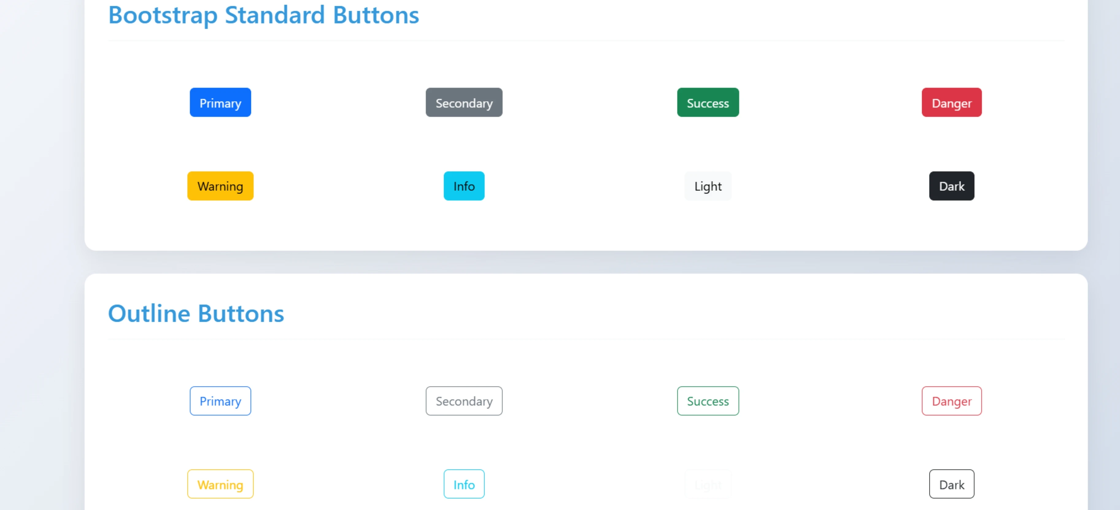
<!-- Standard Bootstrap Buttons -->
<div class="button-section">
<h2 class="section-title">Bootstrap Standard Buttons</h2>
<div class="row">
<div class="col-md-3 col-sm-6 btn-container">
<button class="btn btn-primary">Primary</button>
</div>
<div class="col-md-3 col-sm-6 btn-container">
<button class="btn btn-secondary">Secondary</button>
</div>
<div class="col-md-3 col-sm-6 btn-container">
<button class="btn btn-success">Success</button>
</div>
<div class="col-md-3 col-sm-6 btn-container">
<button class="btn btn-danger">Danger</button>
</div>
<div class="col-md-3 col-sm-6 btn-container">
<button class="btn btn-warning">Warning</button>
</div>
<div class="col-md-3 col-sm-6 btn-container">
<button class="btn btn-info">Info</button>
</div>
<div class="col-md-3 col-sm-6 btn-container">
<button class="btn btn-light">Light</button>
</div>
<div class="col-md-3 col-sm-6 btn-container">
<button class="btn btn-dark">Dark</button>
</div>
</div>
</div>
<!-- Outline Buttons -->
<div class="button-section">
<h2 class="section-title">Outline Buttons</h2>
<div class="row">
<div class="col-md-3 col-sm-6 btn-container">
<button class="btn btn-outline-primary">Primary</button>
</div>
<div class="col-md-3 col-sm-6 btn-container">
<button class="btn btn-outline-secondary">Secondary</button>
</div>
<div class="col-md-3 col-sm-6 btn-container">
<button class="btn btn-outline-success">Success</button>
</div>
<div class="col-md-3 col-sm-6 btn-container">
<button class="btn btn-outline-danger">Danger</button>
</div>
<div class="col-md-3 col-sm-6 btn-container">
<button class="btn btn-outline-warning">Warning</button>
</div>
<div class="col-md-3 col-sm-6 btn-container">
<button class="btn btn-outline-info">Info</button>
</div>
<div class="col-md-3 col-sm-6 btn-container">
<button class="btn btn-outline-light">Light</button>
</div>
<div class="col-md-3 col-sm-6 btn-container">
<button class="btn btn-outline-dark">Dark</button>
</div>
</div>
</div>
<!-- Custom Designed Buttons -->
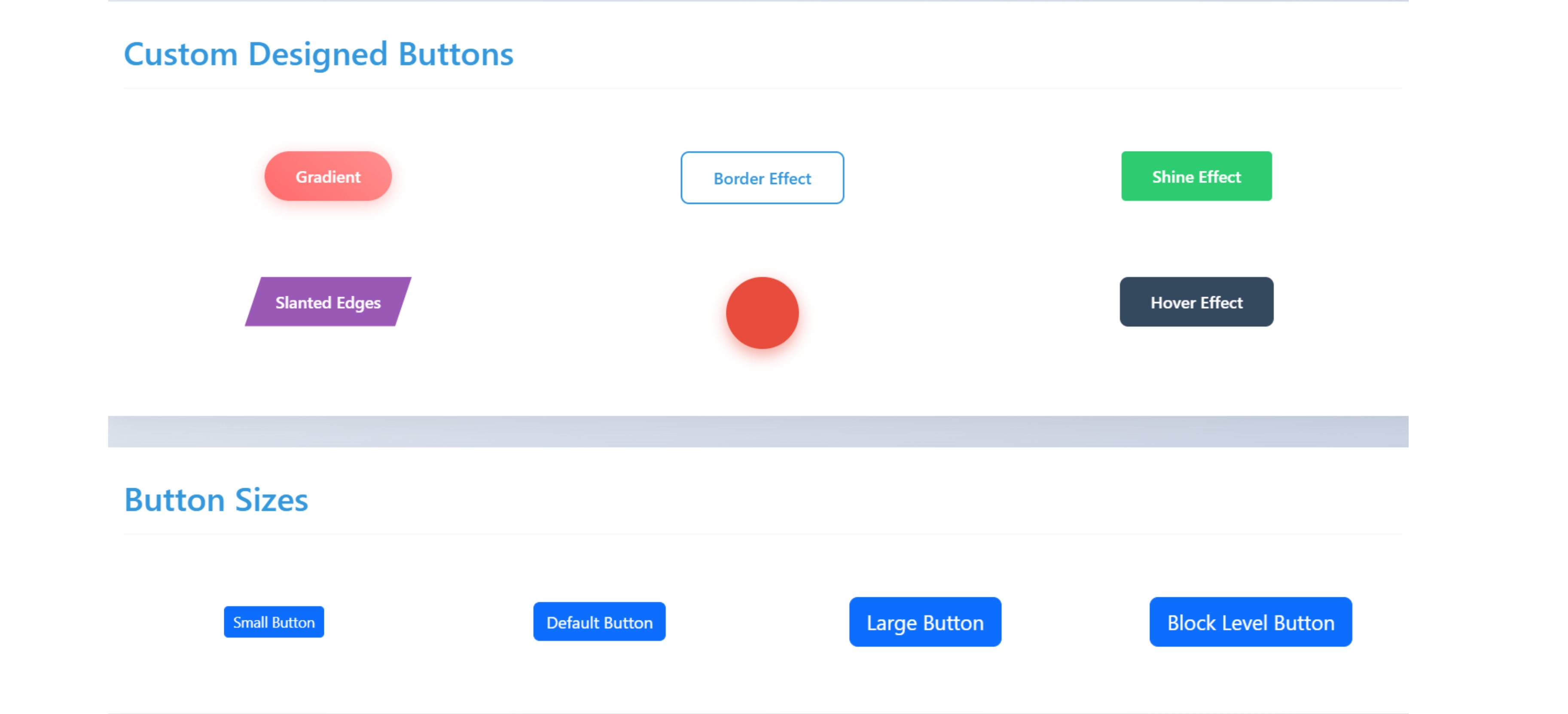
<div class="button-section">
<h2 class="section-title">Custom Designed Buttons</h2>
<div class="row">
<div class="col-md-4 col-sm-6 btn-container">
<button class="btn btn-custom-1">Gradient</button>
</div>
<div class="col-md-4 col-sm-6 btn-container">
<button class="btn btn-custom-2">Border Effect</button>
</div>
<div class="col-md-4 col-sm-6 btn-container">
<button class="btn btn-custom-3">Shine Effect</button>
</div>
<div class="col-md-4 col-sm-6 btn-container">
<button class="btn btn-custom-4">Slanted Edges</button>
</div>
<div class="col-md-4 col-sm-6 btn-container">
<button class="btn btn-custom-5"><i class="fas fa-heart"></i></button>
</div>
<div class="col-md-4 col-sm-6 btn-container">
<button class="btn btn-custom-6"><span>Hover Effect</span></button>
</div>
</div>
</div>
<!-- Button Sizes -->
<div class="button-section">
<h2 class="section-title">Button Sizes</h2>
<div class="row align-items-center">
<div class="col-md-3 col-sm-6 btn-container">
<button class="btn btn-primary btn-sm">Small Button</button>
</div>
<div class="col-md-3 col-sm-6 btn-container">
<button class="btn btn-primary">Default Button</button>
</div>
<div class="col-md-3 col-sm-6 btn-container">
<button class="btn btn-primary btn-lg">Large Button</button>
</div>
<div class="col-md-3 col-sm-6 btn-container">
<button class="btn btn-primary btn-lg btn-block">Block Level Button</button>
</div>
</div>
</div>
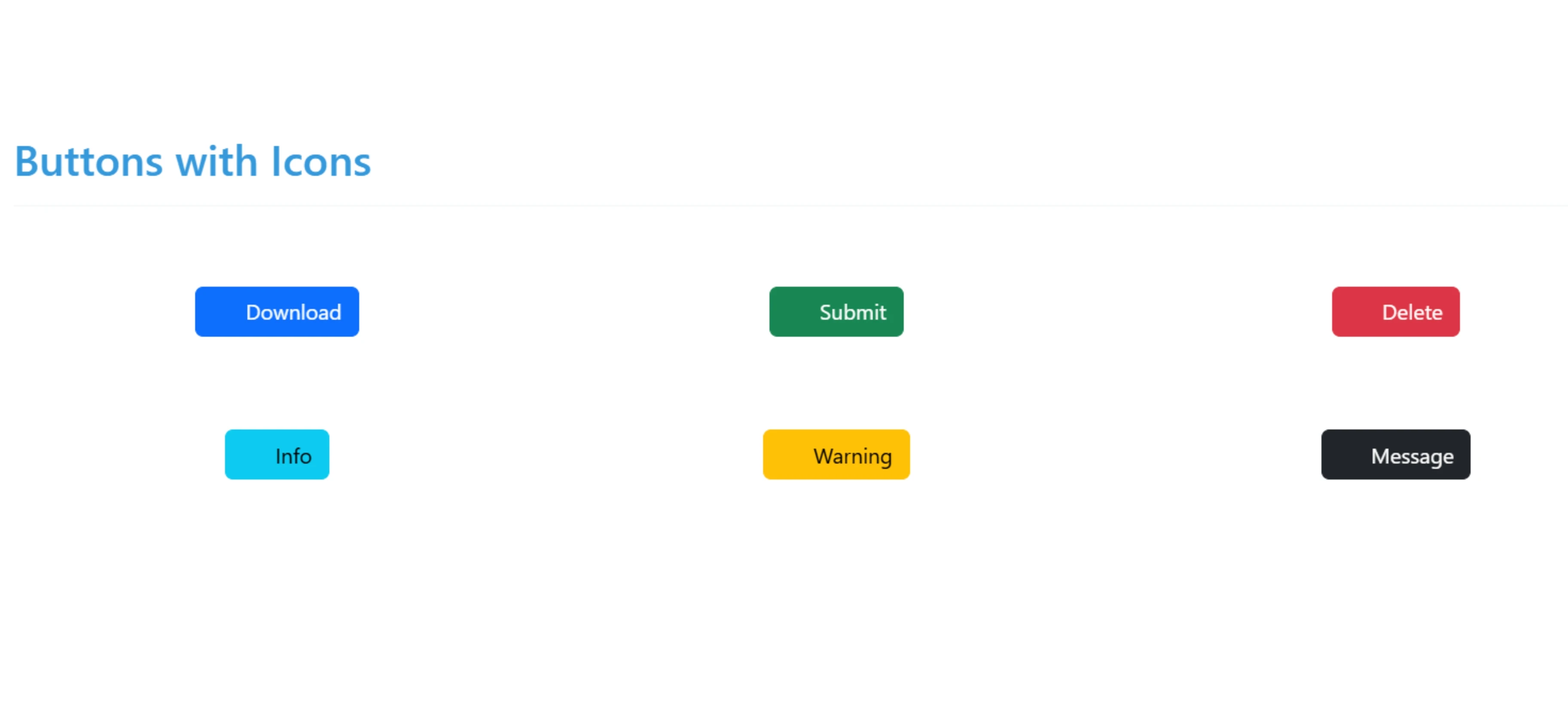
<!-- Button with Icons -->
<div class="button-section">
<h2 class="section-title">Buttons with Icons</h2>
<div class="row">
<div class="col-md-4 col-sm-6 btn-container">
<button class="btn btn-primary">
<i class="fas fa-download me-2"></i> Download
</button>
</div>
<div class="col-md-4 col-sm-6 btn-container">
<button class="btn btn-success">
<i class="fas fa-check-circle me-2"></i> Submit
</button>
</div>
<div class="col-md-4 col-sm-6 btn-container">
<button class="btn btn-danger">
<i class="fas fa-trash-alt me-2"></i> Delete
</button>
</div>
<div class="col-md-4 col-sm-6 btn-container">
<button class="btn btn-info">
<i class="fas fa-info-circle me-2"></i> Info
</button>
</div>
<div class="col-md-4 col-sm-6 btn-container">
<button class="btn btn-warning">
<i class="fas fa-exclamation-triangle me-2"></i> Warning
</button>
</div>
<div class="col-md-4 col-sm-6 btn-container">
<button class="btn btn-dark">
<i class="fas fa-envelope me-2"></i> Message
</button>
</div>
</div>
</div>
</div>
<!-- Toast Notification -->
<div class="toast-container">
<div id="liveToast" class="toast" role="alert" aria-live="assertive" aria-atomic="true">
<div class="toast-header">
<strong class="me-auto">Button Clicked</strong>
<button type="button" class="btn-close" data-bs-dismiss="toast" aria-label="Close"></button>
</div>
<div class="toast-body">
You clicked a button!
</div>
</div>
</div>
</body>CSS
<style>
        body {
            background: linear-gradient(135deg, #f5f7fa 0%, #c3cfe2 100%);
            min-height: 100vh;
            padding: 40px 20px;
            font-family: 'Segoe UI', Tahoma, Geneva, Verdana, sans-serif;
        }

        .header {
            text-align: center;
            margin-bottom: 50px;
        }

        .header h1 {
            color: #2c3e50;
            font-weight: 700;
            margin-bottom: 10px;
        }

        .header p {
            color: #7f8c8d;
            font-size: 18px;
        }

        .button-section {
            background: white;
            border-radius: 15px;
            padding: 30px;
            margin-bottom: 30px;
            box-shadow: 0 10px 30px rgba(0, 0, 0, 0.08);
        }

        .section-title {
            color: #3498db;
            border-bottom: 2px solid #f8f9fa;
            padding-bottom: 15px;
            margin-bottom: 25px;
            font-weight: 600;
        }

        .btn-container {
            margin: 20px 0;
            padding: 15px;
            text-align: center;
        }

        /* Custom Button Styles */
        .btn-custom-1 {
            background: linear-gradient(45deg, #ff6b6b, #ff8e8e);
            border: none;
            border-radius: 50px;
            padding: 12px 30px;
            color: white;
            font-weight: 600;
            box-shadow: 0 4px 15px rgba(255, 107, 107, 0.4);
            transition: all 0.3s ease;
        }

        .btn-custom-1:hover {
            transform: translateY(-3px);
            box-shadow: 0 8px 20px rgba(255, 107, 107, 0.6);
            background: linear-gradient(45deg, #ff5252, #ff7b7b);
        }

        .btn-custom-2 {
            background: transparent;
            border: 2px solid #3498db;
            border-radius: 8px;
            padding: 12px 30px;
            color: #3498db;
            font-weight: 600;
            transition: all 0.3s ease;
        }

        .btn-custom-2:hover {
            background: #3498db;
            color: white;
            transform: scale(1.05);
        }

        .btn-custom-3 {
            background: #2ecc71;
            border: none;
            border-radius: 4px;
            padding: 12px 30px;
            color: white;
            font-weight: 600;
            position: relative;
            overflow: hidden;
            z-index: 1;
        }

        .btn-custom-3:before {
            content: '';
            position: absolute;
            top: 0;
            left: -100%;
            width: 100%;
            height: 100%;
            background: linear-gradient(90deg, transparent, rgba(255,255,255,0.2), transparent);
            transition: all 0.4s ease;
            z-index: -1;
        }

        .btn-custom-3:hover:before {
            left: 100%;
        }

        .btn-custom-3:hover {
            box-shadow: 0 0 20px rgba(46, 204, 113, 0.5);
        }

        .btn-custom-4 {
            background: #9b59b6;
            border: none;
            border-radius: 0;
            padding: 12px 30px;
            color: white;
            font-weight: 600;
            clip-path: polygon(10% 0, 100% 0, 90% 100%, 0% 100%);
            transition: all 0.3s ease;
        }

        .btn-custom-4:hover {
            clip-path: polygon(0 0, 100% 0, 100% 100%, 0% 100%);
            background: #8e44ad;
        }

        .btn-custom-5 {
            background: #e74c3c;
            border: none;
            border-radius: 50%;
            width: 70px;
            height: 70px;
            color: white;
            font-size: 24px;
            box-shadow: 0 6px 15px rgba(231, 76, 60, 0.5);
            transition: all 0.3s ease;
        }

        .btn-custom-5:hover {
            transform: rotate(360deg);
            box-shadow: 0 8px 20px rgba(231, 76, 60, 0.7);
        }

        .btn-custom-6 {
            background: #34495e;
            border: none;
            border-radius: 8px;
            padding: 12px 30px;
            color: white;
            font-weight: 600;
            position: relative;
            overflow: hidden;
        }

        .btn-custom-6 span {
            position: relative;
            z-index: 2;
        }

        .btn-custom-6:after {
            content: '';
            position: absolute;
            top: 0;
            left: 0;
            width: 100%;
            height: 100%;
            background: linear-gradient(45deg, #3498db, #2c3e50);
            opacity: 0;
            transition: all 0.3s ease;
            z-index: 1;
        }

        .btn-custom-6:hover:after {
            opacity: 1;
        }

        /* Animation for click effect */
        @keyframes clickEffect {
            0% { transform: scale(1); }
            50% { transform: scale(0.9); }
            100% { transform: scale(1); }
        }

        .clicked {
            animation: clickEffect 0.3s ease;
        }

        /* Toast notification */
        .toast-container {
            position: fixed;
            bottom: 20px;
            right: 20px;
            z-index: 1050;
        }

        /* Responsive adjustments */
        @media (max-width: 768px) {
            .btn-container {
                margin: 10px 0;
            }
        }
    </style>
JavaScript
<script src="https://cdn.jsdelivr.net/npm/bootstrap@5.3.0-alpha1/dist/js/bootstrap.bundle.min.js"></script>
    <script>
        document.addEventListener('DOMContentLoaded', function() {
            // Add click effect to all buttons
            const buttons = document.querySelectorAll('button');
            const toastEl = document.getElementById('liveToast');
            const toast = new bootstrap.Toast(toastEl);

            buttons.forEach(button => {
                button.addEventListener('click', function() {
                    // Add click animation
                    this.classList.add('clicked');

                    // Show toast notification
                    toast.show();

                    // Remove animation class after animation completes
                    setTimeout(() => {
                        this.classList.remove('clicked');
                    }, 300);
                });
            });
        });
    </script>