Project Gallery
Explore 4-Step Process in detail
1
/1
100%
Project Overview
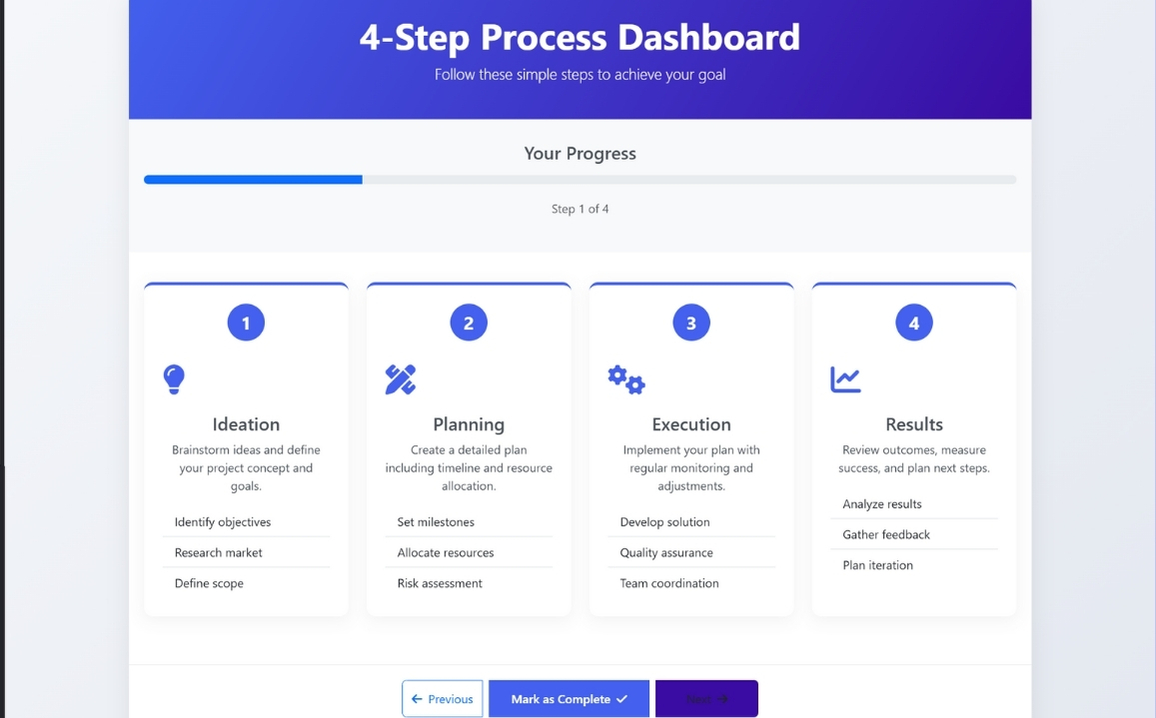
4-Step Process
Project Description
I'll create a clean, modern four-step process with excellent alignment using Bootstrap, custom CSS, and JavaScript.
Clean, Modern Design: Professional color scheme with gradient header and card-based layout
Responsive Layout: Works on all screen sizes using Bootstrap's grid system
Four-Step Process: Clearly defined steps with icons, numbers, and descriptions
Visual Progress Indicator: Progress bar that updates when steps are completed
Interactive Elements: Cards highlight when selected, buttons have hover effects
Smooth Animations: Subtle animations for card loading and interactions
Well-Aligned Components: Consistent spacing and alignment throughout
HTML
<!DOCTYPE html>
<html lang="en">
<head>
    <meta charset="UTF-8">
    <meta name="viewport" content="width=device-width, initial-scale=1.0">
    <title>4-Step Process Dashboard</title>
    <!-- Bootstrap CSS -->
    <link href="https://cdn.jsdelivr.net/npm/bootstrap@5.3.0/dist/css/bootstrap.min.css" rel="stylesheet">
    <!-- Font Awesome -->
    <link rel="stylesheet" href="https://cdnjs.cloudflare.com/ajax/libs/font-awesome/6.4.0/css/all.min.css">

</head>
<body>
    <div class="dashboard-container">
        <!-- Header -->
        <div class="header">
            <h1 class="display-5 fw-bold">4-Step Process Dashboard</h1>
            <p class="lead">Follow these simple steps to achieve your goal</p>
        </div>

        <!-- Progress Bar -->
        <div class="progress-container text-center">
            <h4 class="mb-3">Your Progress</h4>
            <div class="progress">
                <div class="progress-bar" role="progressbar" style="width: 25%" aria-valuenow="25" aria-valuemin="0" aria-valuemax="100"></div>
            </div>
            <p class="text-muted">Step <span id="current-step">1</span> of 4</p>
        </div>

        <!-- Steps -->
        <div class="step-container">
            <div class="row">
                <!-- Step 1 -->
                <div class="col-md-3 col-sm-6 mb-4">
                    <div class="step-card">
                        <div class="step-number">1</div>
                        <div class="step-icon">
                            <i class="fas fa-lightbulb"></i>
                        </div>
                        <h4 class="text-center">Ideation</h4>
                        <p class="text-center">Brainstorm ideas and define your project concept and goals.</p>
                        <ul class="list-group list-group-flush">
                            <li class="list-group-item">Identify objectives</li>
                            <li class="list-group-item">Research market</li>
                            <li class="list-group-item">Define scope</li>
                        </ul>
                    </div>
                </div>

                <!-- Step 2 -->
                <div class="col-md-3 col-sm-6 mb-4">
                    <div class="step-card">
                        <div class="step-number">2</div>
                        <div class="step-icon">
                            <i class="fas fa-pencil-ruler"></i>
                        </div>
                        <h4 class="text-center">Planning</h4>
                        <p class="text-center">Create a detailed plan including timeline and resource allocation.</p>
                        <ul class="list-group list-group-flush">
                            <li class="list-group-item">Set milestones</li>
                            <li class="list-group-item">Allocate resources</li>
                            <li class="list-group-item">Risk assessment</li>
                        </ul>
                    </div>
                </div>

                <!-- Step 3 -->
                <div class="col-md-3 col-sm-6 mb-4">
                    <div class="step-card">
                        <div class="step-number">3</div>
                        <div class="step-icon">
                            <i class="fas fa-cogs"></i>
                        </div>
                        <h4 class="text-center">Execution</h4>
                        <p class="text-center">Implement your plan with regular monitoring and adjustments.</p>
                        <ul class="list-group list-group-flush">
                            <li class="list-group-item">Develop solution</li>
                            <li class="list-group-item">Quality assurance</li>
                            <li class="list-group-item">Team coordination</li>
                        </ul>
                    </div>
                </div>

                <!-- Step 4 -->
                <div class="col-md-3 col-sm-6 mb-4">
                    <div class="step-card">
                        <div class="step-number">4</div>
                        <div class="step-icon">
                            <i class="fas fa-chart-line"></i>
                        </div>
                        <h4 class="text-center">Results</h4>
                        <p class="text-center">Review outcomes, measure success, and plan next steps.</p>
                        <ul class="list-group list-group-flush">
                            <li class="list-group-item">Analyze results</li>
                            <li class="list-group-item">Gather feedback</li>
                            <li class="list-group-item">Plan iteration</li>
                        </ul>
                    </div>
                </div>
            </div>
        </div>

        <!-- Navigation -->
        <div class="navigation text-center">
            <div class="btn-group" role="group">
                <button type="button" class="btn btn-outline-primary">
                    <i class="fas fa-arrow-left me-2"></i>Previous
                </button>
                <button type="button" class="btn btn-primary ms-2">
                    Mark as Complete<i class="fas fa-check ms-2"></i>
                </button>
                <button type="button" class="btn btn-next ms-2">
                    Next<i class="fas fa-arrow-right ms-2"></i>
                </button>
            </div>

            <div class="mt-4">
                <button type="button" class="btn btn-outline-secondary me-2">
                    <i class="fas fa-sync-alt me-2"></i>Reset Process
                </button>
                <button type="button" class="btn btn-outline-info">
                    <i class="fas fa-question-circle me-2"></i>Help
                </button>
            </div>
        </div>
    </div>


</body>
</html>
CSS
<style>
        :root {
            --primary: #4361ee;
            --secondary: #3a0ca3;
            --success: #4cc9f0;
            --info: #4895ef;
            --warning: #f72585;
            --light: #f8f9fa;
            --dark: #212529;
        }

        body {
            font-family: 'Segoe UI', Tahoma, Geneva, Verdana, sans-serif;
            background: linear-gradient(135deg, #f5f7fa 0%, #e4e8f0 100%);
            color: #495057;
            min-height: 100vh;
            padding: 20px;
        }

        .dashboard-container {
            max-width: 1200px;
            margin: 0 auto;
            background: white;
            border-radius: 15px;
            box-shadow: 0 10px 30px rgba(0, 0, 0, 0.08);
            overflow: hidden;
        }

        .header {
            background: linear-gradient(120deg, var(--primary), var(--secondary));
            color: white;
            padding: 30px;
            text-align: center;
        }

        .step-container {
            padding: 40px 20px;
        }

        .step-card {
            background: white;
            border-radius: 12px;
            box-shadow: 0 5px 20px rgba(0, 0, 0, 0.05);
            padding: 25px;
            height: 100%;
            transition: transform 0.3s, box-shadow 0.3s;
            border-top: 4px solid var(--primary);
        }

        .step-card:hover {
            transform: translateY(-5px);
            box-shadow: 0 8px 25px rgba(0, 0, 0, 0.1);
        }

        .step-number {
            width: 50px;
            height: 50px;
            background: var(--primary);
            color: white;
            border-radius: 50%;
            display: flex;
            align-items: center;
            justify-content: center;
            font-size: 1.5rem;
            font-weight: bold;
            margin: 0 auto 20px;
        }

        .progress-container {
            padding: 30px 20px;
            background: var(--light);
        }

        .progress {
            height: 12px;
            border-radius: 10px;
            margin-bottom: 20px;
        }

        .btn-primary {
            background: var(--primary);
            border: none;
            padding: 12px 30px;
            font-weight: 600;
            border-radius: 30px;
            transition: all 0.3s;
        }

        .btn-primary:hover {
            background: var(--secondary);
            transform: translateY(-2px);
        }

        .btn-next {
            background: var(--secondary);
            padding: 12px 40px;
        }

        .navigation {
            padding: 20px;
            background: white;
            border-top: 1px solid #eee;
        }

        .step-icon {
            font-size: 2.5rem;
            color: var(--primary);
            margin-bottom: 15px;
        }

        @media (max-width: 768px) {
            .step-card {
                margin-bottom: 20px;
            }
        }
    </style>
JavaScript
<!-- Bootstrap & jQuery -->
    <script src="https://code.jquery.com/jquery-3.6.0.min.js"></script>
    <script src="https://cdn.jsdelivr.net/npm/bootstrap@5.3.0/dist/js/bootstrap.bundle.min.js"></script>

    <script>
        $(document).ready(function() {
            // Add animation to cards on page load
            $('.step-card').each(function(i) {
                $(this).delay(i * 200).animate({opacity: 1, top: 0}, 500);
            });

            // Add click event to cards
            $('.step-card').click(function() {
                $('.step-card').removeClass('border-warning');
                $(this).addClass('border-warning');

                // Update progress
                const step = $(this).find('.step-number').text();
                $('#current-step').text(step);
                $('.progress-bar').css('width', (step * 25) + '%');
            });

            // Button hover effects
            $('.btn').hover(function() {
                $(this).css('transform', 'translateY(-2px)');
            }, function() {
                $(this).css('transform', 'translateY(0)');
            });
        });
    </script>