Project Gallery
Explore 3D Vertical Flip Cards UI – Interactive Team Profiles in detail
1
/1
100%
Project Overview
3D Vertical Flip Cards UI – Interactive Team Profiles
Project Description
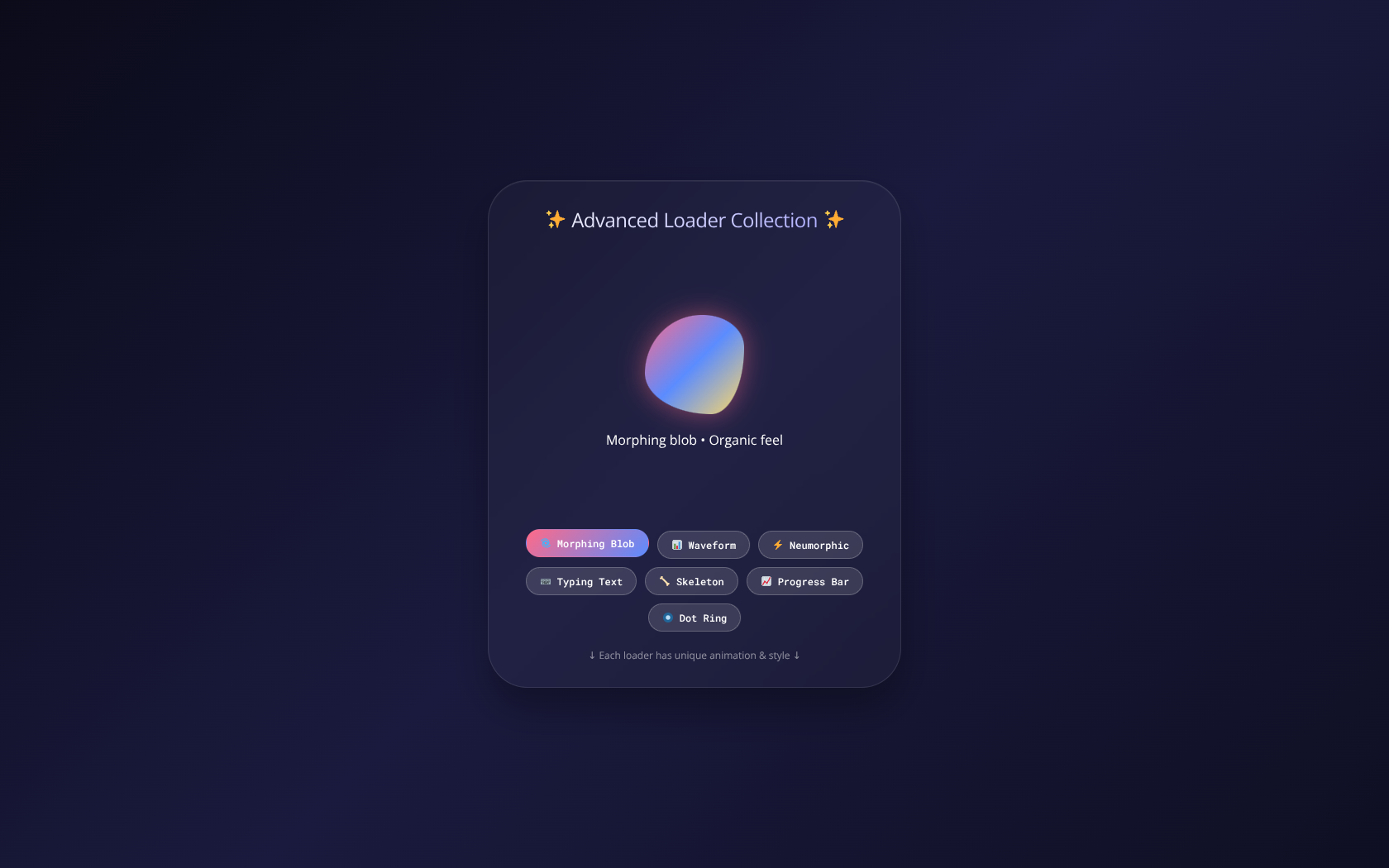
A modern and responsive card interface featuring smooth 3D vertical flip animations. Each card reveals detailed team profile information on the back, creating an engaging and interactive user experience. Built using pure HTML, CSS, and JavaScript with a focus on performance and clean design.
HTML
<!DOCTYPE html>
<html lang="en">
<head>
  <meta charset="UTF-8">
  <meta name="viewport" content="width=device-width, initial-scale=1.0">
  <title>Ultimate Advanced Loader Collection | 6+ Styles</title>
</head>
<body>
<div class="loader-showcase">
  <h2>✨ Advanced Loader Collection ✨</h2>
  <div id="loaderContainer" class="loader-container">
    <!-- Dynamic loader will appear here -->
  </div>
  <div class="nav-buttons" id="loaderNav">
    <button class="loader-btn active" data-loader="blob">🌀 Morphing Blob</button>
    <button class="loader-btn" data-loader="waveform">📊 Waveform</button>
    <button class="loader-btn" data-loader="neumorphic">⚡ Neumorphic</button>
    <button class="loader-btn" data-loader="typing">⌨️ Typing Text</button>
    <button class="loader-btn" data-loader="skeleton">🦴 Skeleton</button>
    <button class="loader-btn" data-loader="progress">📈 Progress Bar</button>
    <button class="loader-btn" data-loader="dotring">🔘 Dot Ring</button>
  </div>
  <div class="sub-text">↓ Each loader has unique animation & style ↓</div>
</div>

</body>
</html>
CSS
<style>
    * {
      margin: 0;
      padding: 0;
      box-sizing: border-box;
    }

    body {
      min-height: 100vh;
      background: linear-gradient(135deg, #0b0b1a 0%, #1a1a3e 50%, #0f0f23 100%);
      font-family: 'Segoe UI', 'Poppins', 'Inter', system-ui, sans-serif;
      display: flex;
      justify-content: center;
      align-items: center;
      padding: 20px;
    }

    /* Main Container */
    .loader-showcase {
      max-width: 500px;
      width: 100%;
      background: rgba(255, 255, 255, 0.03);
      backdrop-filter: blur(10px);
      border-radius: 48px;
      padding: 30px 24px;
      box-shadow: 0 25px 45px rgba(0, 0, 0, 0.3), inset 0 1px 0 rgba(255, 255, 255, 0.05);
      border: 1px solid rgba(255, 255, 255, 0.1);
    }

    h2 {
      text-align: center;
      color: white;
      font-weight: 500;
      letter-spacing: -0.5px;
      margin-bottom: 30px;
      background: linear-gradient(135deg, #fff, #a0a0ff);
      -webkit-background-clip: text;
      background-clip: text;
      color: transparent;
    }

    /* Loader Container */
    .loader-container {
      min-height: 300px;
      display: flex;
      flex-direction: column;
      justify-content: center;
      align-items: center;
      transition: all 0.3s ease;
    }

    /* ========== LOADER 1: MORPHING BLOB ========== */
    .blob-loader {
      width: 120px;
      height: 120px;
      background: linear-gradient(135deg, #ff6a88, #5b8cff, #ffd966);
      border-radius: 60% 40% 30% 70% / 60% 30% 70% 40%;
      animation: morphBlob 3s ease-in-out infinite;
      box-shadow: 0 0 30px rgba(255, 106, 136, 0.5);
    }

    @keyframes morphBlob {
      0% { border-radius: 60% 40% 30% 70% / 60% 30% 70% 40%; }
      50% { border-radius: 30% 60% 70% 40% / 50% 60% 30% 60%; }
      100% { border-radius: 60% 40% 30% 70% / 60% 30% 70% 40%; }
    }

    /* ========== LOADER 2: WAVEFORM ========== */
    .waveform {
      display: flex;
      gap: 8px;
      align-items: center;
      justify-content: center;
      height: 80px;
    }
    .wave-bar {
      width: 8px;
      height: 30px;
      background: linear-gradient(180deg, #ff6a88, #5b8cff);
      border-radius: 4px;
      animation: wave 0.8s ease-in-out infinite alternate;
    }
    .wave-bar:nth-child(1) { animation-delay: 0s; height: 20px; }
    .wave-bar:nth-child(2) { animation-delay: 0.1s; height: 40px; }
    .wave-bar:nth-child(3) { animation-delay: 0.2s; height: 60px; }
    .wave-bar:nth-child(4) { animation-delay: 0.3s; height: 50px; }
    .wave-bar:nth-child(5) { animation-delay: 0.4s; height: 30px; }
    .wave-bar:nth-child(6) { animation-delay: 0.5s; height: 45px; }
    .wave-bar:nth-child(7) { animation-delay: 0.6s; height: 25px; }

    @keyframes wave {
      0% { height: 20px; opacity: 0.4; }
      100% { height: 70px; opacity: 1; }
    }

    /* ========== LOADER 3: NEUMORPHIC SPINNER ========== */
    .neumorphic-spinner {
      width: 100px;
      height: 100px;
      border-radius: 50%;
      background: #1a1a3e;
      box-shadow: 8px 8px 16px #0a0a1a, -8px -8px 16px #2a2a5e;
      animation: pulseNeumorph 1.5s ease-in-out infinite;
      position: relative;
    }
    .neumorphic-spinner::before {
      content: '';
      position: absolute;
      top: 10px;
      left: 10px;
      right: 10px;
      bottom: 10px;
      border-radius: 50%;
      background: linear-gradient(135deg, #ff6a88, #5b8cff);
      animation: spin 1s linear infinite;
    }
    @keyframes spin {
      to { transform: rotate(360deg); }
    }
    @keyframes pulseNeumorph {
      0%, 100% { transform: scale(1); }
      50% { transform: scale(1.05); }
    }

    /* ========== LOADER 4: TYPING TEXT ========== */
    .typing-loader {
      font-size: 24px;
      font-weight: 600;
      background: linear-gradient(135deg, #ff6a88, #ffd966);
      -webkit-background-clip: text;
      background-clip: text;
      color: transparent;
      font-family: monospace;
    }
    .cursor {
      display: inline-block;
      width: 3px;
      height: 28px;
      background: #ff6a88;
      margin-left: 4px;
      animation: blink 1s step-end infinite;
      vertical-align: middle;
    }
    @keyframes blink {
      0%, 100% { opacity: 1; }
      50% { opacity: 0; }
    }

    /* ========== LOADER 5: SKELETON SCREEN ========== */
    .skeleton-card {
      width: 280px;
      background: rgba(255,255,255,0.05);
      border-radius: 20px;
      padding: 20px;
    }
    .skeleton-avatar {
      width: 60px;
      height: 60px;
      border-radius: 50%;
      background: linear-gradient(90deg, #2a2a5e 25%, #3a3a7e 50%, #2a2a5e 75%);
      background-size: 200% 100%;
      animation: skeletonShimmer 1.5s infinite;
      margin-bottom: 15px;
    }
    .skeleton-line {
      height: 12px;
      background: linear-gradient(90deg, #2a2a5e 25%, #3a3a7e 50%, #2a2a5e 75%);
      background-size: 200% 100%;
      animation: skeletonShimmer 1.5s infinite;
      border-radius: 6px;
      margin-bottom: 10px;
    }
    .skeleton-line.short { width: 60%; }
    .skeleton-line.medium { width: 80%; }
    @keyframes skeletonShimmer {
      0% { background-position: 200% 0; }
      100% { background-position: -200% 0; }
    }

    /* ========== LOADER 6: GLOWING PROGRESS BAR ========== */
    .progress-wrapper {
      width: 280px;
    }
    .progress-label {
      display: flex;
      justify-content: space-between;
      color: white;
      margin-bottom: 10px;
      font-size: 14px;
    }
    .glow-progress {
      width: 100%;
      height: 10px;
      background: rgba(255,255,255,0.1);
      border-radius: 10px;
      overflow: hidden;
    }
    .glow-fill {
      width: 0%;
      height: 100%;
      background: linear-gradient(90deg, #ff6a88, #5b8cff, #ffd966);
      border-radius: 10px;
      animation: fillProgress 2s ease-out infinite;
      box-shadow: 0 0 10px #ff6a88;
    }
    @keyframes fillProgress {
      0% { width: 0%; }
      50% { width: 70%; }
      100% { width: 100%; }
    }

    /* ========== LOADER 7: RING OF DOTS ========== */
    .dot-ring {
      position: relative;
      width: 100px;
      height: 100px;
    }
    .dot-ring div {
      position: absolute;
      width: 12px;
      height: 12px;
      background: #ff6a88;
      border-radius: 50%;
      animation: orbit 1.2s linear infinite;
    }
    .dot-ring div:nth-child(1) { top: 0; left: 44px; animation-delay: 0s; }
    .dot-ring div:nth-child(2) { top: 44px; right: 0; animation-delay: 0.15s; }
    .dot-ring div:nth-child(3) { bottom: 0; left: 44px; animation-delay: 0.3s; }
    .dot-ring div:nth-child(4) { top: 44px; left: 0; animation-delay: 0.45s; }
    @keyframes orbit {
      0%, 100% { transform: scale(1); opacity: 1; }
      50% { transform: scale(1.5); opacity: 0.5; background: #5b8cff; }
    }

    /* Button Navigation */
    .nav-buttons {
      display: flex;
      flex-wrap: wrap;
      gap: 10px;
      justify-content: center;
      margin-top: 30px;
    }
    .loader-btn {
      background: rgba(255,255,255,0.1);
      border: 1px solid rgba(255,255,255,0.2);
      color: white;
      padding: 8px 16px;
      border-radius: 40px;
      cursor: pointer;
      font-size: 12px;
      font-weight: 500;
      transition: all 0.3s ease;
      backdrop-filter: blur(5px);
    }
    .loader-btn:hover, .loader-btn.active {
      background: linear-gradient(135deg, #ff6a88, #5b8cff);
      border-color: transparent;
      transform: translateY(-2px);
    }
    .sub-text {
      text-align: center;
      color: rgba(255,255,255,0.5);
      font-size: 12px;
      margin-top: 20px;
    }
  </style>
JavaScript
<script>
  // Loader definitions
  const loaders = {
    blob: `
      <div class="blob-loader"></div>
      <p style="color:white; margin-top:20px;">Morphing blob • Organic feel</p>
    `,
    waveform: `
      <div class="waveform">
        <div class="wave-bar"></div><div class="wave-bar"></div><div class="wave-bar"></div>
        <div class="wave-bar"></div><div class="wave-bar"></div><div class="wave-bar"></div>
        <div class="wave-bar"></div>
      </div>
      <p style="color:white; margin-top:20px;">Audio waveform • Pulse animation</p>
    `,
    neumorphic: `
      <div class="neumorphic-spinner"></div>
      <p style="color:white; margin-top:20px;">Neumorphic spinner • 3D soft UI</p>
    `,
    typing: `
      <div class="typing-loader">
        Loading<span id="typingText"></span><span class="cursor"></span>
      </div>
      <p style="color:white; margin-top:20px;">Typing effect • Retro terminal</p>
    `,
    skeleton: `
      <div class="skeleton-card">
        <div class="skeleton-avatar"></div>
        <div class="skeleton-line medium"></div>
        <div class="skeleton-line"></div>
        <div class="skeleton-line short"></div>
      </div>
      <p style="color:white; margin-top:20px;">Skeleton screen • Content placeholder</p>
    `,
    progress: `
      <div class="progress-wrapper">
        <div class="progress-label"><span>Loading assets</span><span id="progressPercent">0%</span></div>
        <div class="glow-progress"><div class="glow-fill" id="glowFill"></div></div>
      </div>
      <p style="color:white; margin-top:20px;">Dynamic progress • Real-time simulation</p>
    `,
    dotring: `
      <div class="dot-ring">
        <div></div><div></div><div></div><div></div>
      </div>
      <p style="color:white; margin-top:20px;">Orbiting dots • Circular motion</p>
    `
  };

  let currentLoader = 'blob';
  let progressInterval = null;
  let typingInterval = null;
  let typingIndex = 0;
  const typingWords = ['▰▰▰', '▰▰▱', '▰▱▱', '▱▱▱', '▰▰▰', 'LOADING', 'please wait', 'almost there'];

  function stopAllIntervals() {
    if (progressInterval) clearInterval(progressInterval);
    if (typingInterval) clearInterval(typingInterval);
  }

  function initTypingEffect() {
    const typingSpan = document.getElementById('typingText');
    if (!typingSpan) return;
    typingIndex = 0;
    typingInterval = setInterval(() => {
      typingSpan.textContent = typingWords[typingIndex % typingWords.length];
      typingIndex++;
    }, 400);
  }

  function initProgressSimulation() {
    let percent = 0;
    const percentSpan = document.getElementById('progressPercent');
    const fillDiv = document.getElementById('glowFill');
    if (!percentSpan || !fillDiv) return;
    progressInterval = setInterval(() => {
      if (percent < 100) {
        percent += Math.floor(Math.random() * 8) + 2;
        if (percent > 100) percent = 100;
        percentSpan.textContent = percent + '%';
        fillDiv.style.width = percent + '%';
      } else {
        clearInterval(progressInterval);
        setTimeout(() => {
          if (currentLoader === 'progress') {
            percent = 0;
            percentSpan.textContent = '0%';
            fillDiv.style.width = '0%';
            initProgressSimulation();
          }
        }, 1500);
      }
    }, 200);
  }

  function switchLoader(loaderId) {
    currentLoader = loaderId;
    stopAllIntervals();

    const container = document.getElementById('loaderContainer');
    if (!container) return;

    container.innerHTML = loaders[loaderId];

    // Initialize special effects
    if (loaderId === 'typing') {
      initTypingEffect();
    } else if (loaderId === 'progress') {
      initProgressSimulation();
    }
  }

  // Event listeners for buttons
  document.querySelectorAll('.loader-btn').forEach(btn => {
    btn.addEventListener('click', () => {
      document.querySelectorAll('.loader-btn').forEach(b => b.classList.remove('active'));
      btn.classList.add('active');
      const loaderId = btn.getAttribute('data-loader');
      if (loaderId) switchLoader(loaderId);
    });
  });

  // Start with blob loader
  switchLoader('blob');
</script>